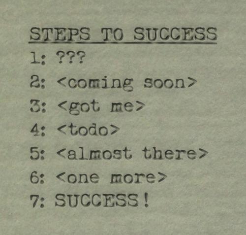
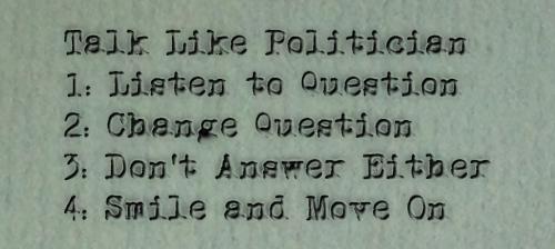
So, that's (as in, the picture above relates) the basic methodology I used in InkScape.
I wrote some script (call it copy), selected a suitable (royalty free, unrestricted) typewriter font, modified it by superimposing two distorted layers (as described above), and placed the combined layers over a background image selected for its textural qualities.
As to those background images, I spent a few hours one day (whilst on vacation, no less) rummaging around and taking photographs of various pieces of stationary in various light settings. Though, the one above is weathered paint taken on a separate occasion.
Brett Rants
The Typewriter Project
Mediocrity Beats A No Show


I can't say I particularly care for this particular image (above). It's representative of the idea which drives this page, a fake typewritten snippet. But I question whether said text has widespread appeal. And I definitely don't care for the background used.

This one is better. I like the text... even if the idea is far from original. But then, the inspiration for this snippet was, also, the inspiration for this project. And that has to count for something.

It all comes together in this last image. The text works for me. The background is solid. And although the text is modified the same way on this image as all the others (even if I used different typewriter fonts throughout), it all seems to work particularly well.
Also, I can remember when green card stock like this (of which this may be an actual photographic enlargement) denoted high quality (as in, important, technical, and/or Top Secret) information.
I assume you are familiar with manilla folders. Well, there was a time when those manilla folders were often split into categories with green card stock inserts (or larger folders) between. And the really important sub-folders were made of this same material.
Eh, that's probably not clear. Green Card Stock was a thing back in the day.
next Brett Rants entry
Home Brett Rants Index
I question whether an animation (of the text being typed) is worth the effort. Of course, that's jumping ahead, as the original idea was to compose a fair number of these cards... and these four were as far as I got.
© copyright 2020 Brett Paufler
paufler.net@gmail.com