The First Listing
I'm getting old. If I don't attend (to diet and exercise), I will gain weight. Actually, as it is, I've gained tons of weight. But at least it's all muscle.
For the insomniacs in the audience, here's a complete listing of what I ate in November of 2017:
calorie-counter-what-i-ate.txt
And after reading it through, I only have a few thoughts:
1) I cleansed the list of any brand names, because... pay me or you don't exist, which means, you don't exist, because I have no expectation of ever being paid for this sort of thing.
2) I was drinking a lot more smoothies than I am now.
3) I am still on the cough drops... or herbal supplements, if you prefer. But as they contain Menthol, I believe cough drop is the proper term. I use them to keep my mouth busy (when bored), to stave off eating for a bit here and there (but mostly, there), and because of allergies.
4) I have hot chocolate everyday.
It's what's for breakfast! And has been for years... for at least a decade now.
5) There is not much toast in the listing, as I am off that, now. But undoubtedly, back in the day, it was heavily buttered toast (with jam, but of course) and a regular diet of cookies (along with middle age and a sedentary lifestyle), which pushed me into the class of weight conscious Americans.
Unfortunately, the
What I Ate data isn't overly useful. And I pretty much recognized that right away.
The Second Listing
Thus, when I started the second (and last month) of data collection, I declined to note what I ate; and instead, recorded when I was eating and how many calories I thought I might be consuming. Meaning, the following figures are off-the-cuff and very-very rough. But we are not scientists (and even if we were, we'd likely deny it).
Here's the raw data for the second round:
calorie-counter.txt
But then, raw data?
Who's got time for that?
How about a few graphs?
OK, then!
By Popular Demand
Graphs It Is!
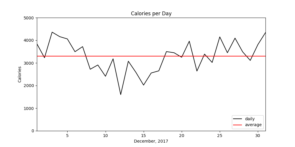
This is a pretty simply graph showing the total calories eaten per day for the length of the month (black) with the overall average (in red).
Per Day
Average  3297 cal
Smallest 1600 cal
Largest  4360 cal
As one can see, by the end of the month, my eating habits had reverted back to normal.
Perhaps this is why most advertised diets last ten days? After all, that's about how long I managed to reduce my total caloric intake.
But that's not the only graph.
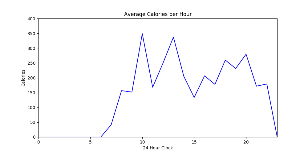
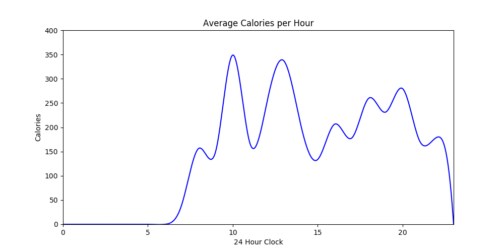
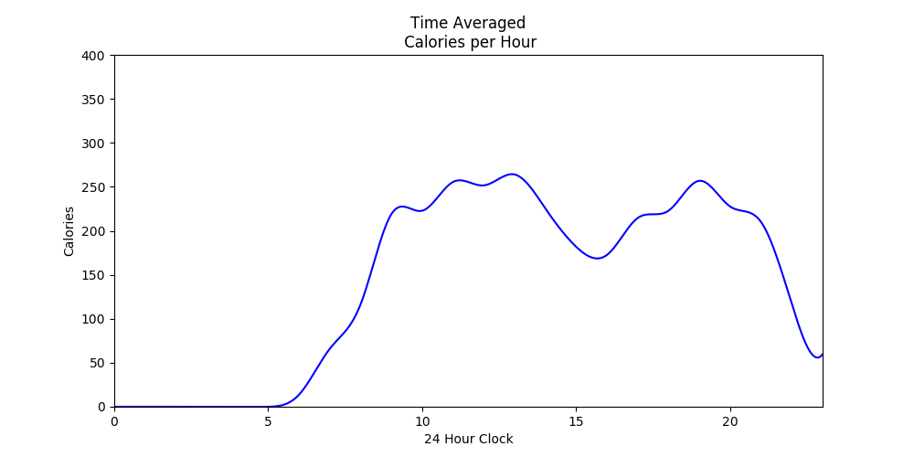
The above three graphs all derive from the same data and show when during a twenty-four hour cycle I tend to eat.
The different shapes (curve properties) are the result of different smoothing functions.
Left:   Raw Data
Middle: Extrapolated
Right:  Time Averaged
Extrapolated means the data points are fit to a smooth curve.
Whereas, Time Averaging means... um, I recorded the data, so I know my measurements aren't very accurate. As such, I split any given measurement equally between the hour before, during, and after it was recorded to create a sort of moving average.
I tend to eat two large meals a day. And for the first meal, I either eat a bit early or a bit late... likely the difference between eating in and eating out, as I know I tend to eat out later in the day.
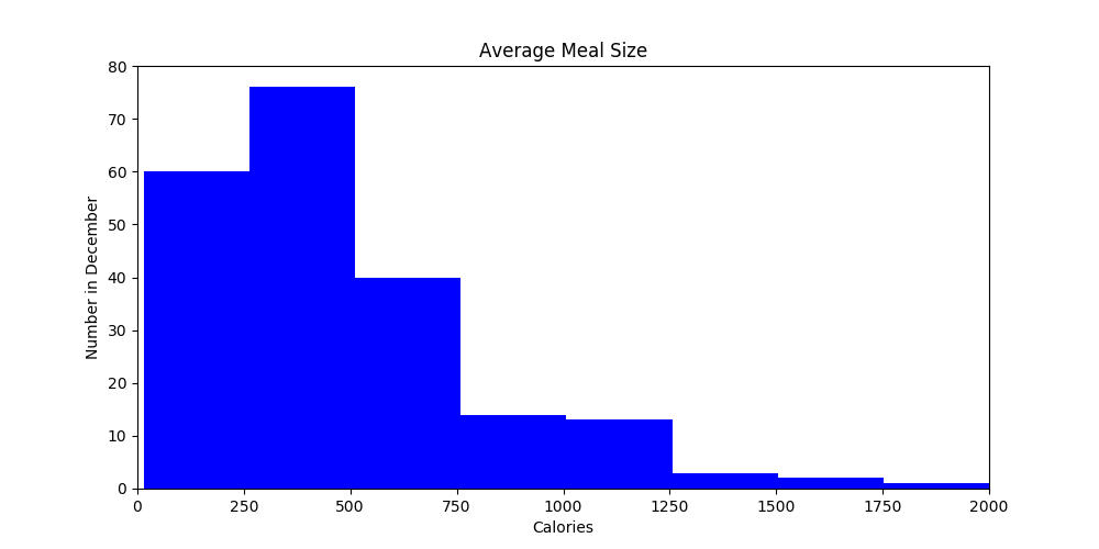
This is a histogram showing the number of meals I ate over the month (209 recorded measurements) grouped by size.
I snack, a lot. So, it is not surprising the histogram is weighted towards the low end (though, I think technically, that means it is skewed to the right).
Note: The overall average meal size was 489 calories.
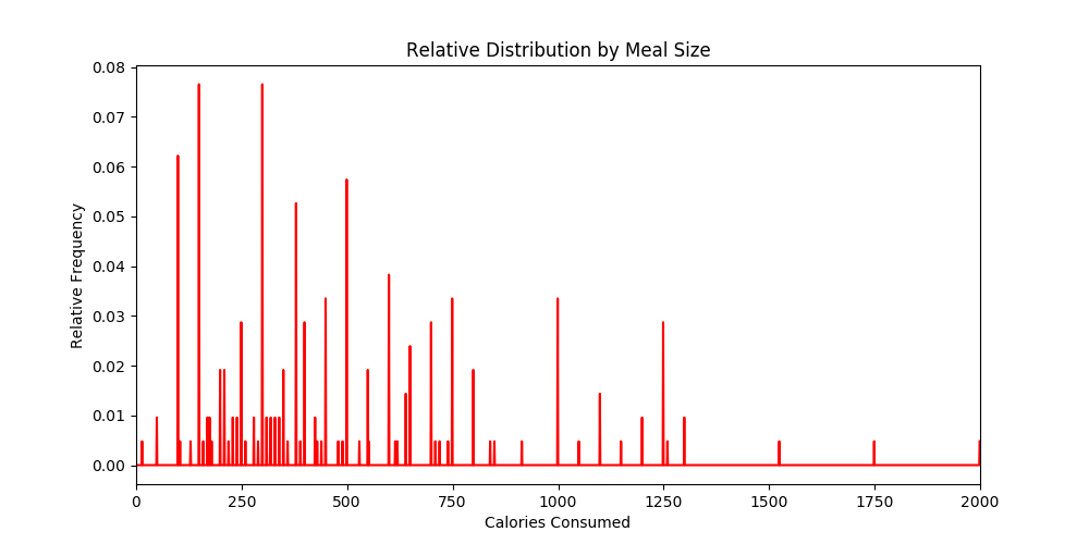
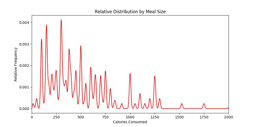
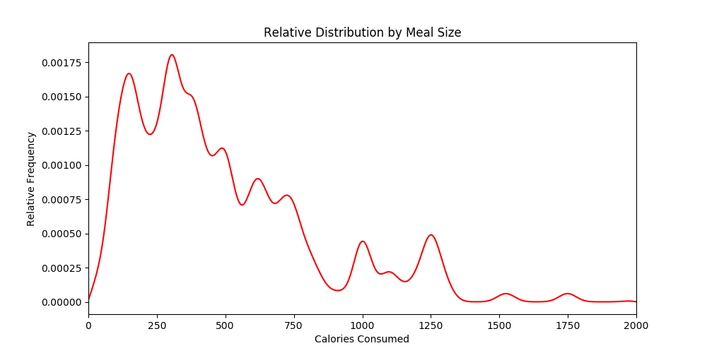
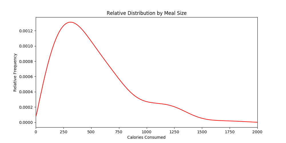
Above (and below) are probability distributions showing how likely it was for me to eat a meal of any given size. The visualization is very similar to the histogram above, the main difference being that the unit on the vertical axis is a probability rather than a number count.
Left:   Raw Data
Middle: Smoothed a Bit
Right:  Smoothed a Bit More
Below:  Very-Very Smooth

Once again, the average (mean) meal size was 489 cal. Based on the curve, the median was (clearly... or maybe I don't know now to read a graph like this) a bit lower (say in the 350 cal range, which is suspiciously close to the calories in a cup of hot chocolate -- at 380cal/cup for me), and the mode was... well, we (or once again, I) have a two way tie at... um, call it 125 calories and 300 calories.
Python Scripts
The above graphs were made using
calorie-counter-script-py.txt, while the graphs below were made using
calorie-counter-class-py.txt.
The first Python Script was intended to be more accessible to programming newbies (so, like, lots of introductory concepts are explained), while more experienced programmers will likely find the second file to be easier to read, as it omits such tiresome details.
Hey!
I, also, Tracked Protein!
Yeah, that's right. I spent a full day writing code (and commenting said code, seriously, that first code script should be a breeze for a newbie to read... or not, who knows), before remembering that I had, also, recorded protein consumption.
So up above, if you had bothered to look at the raw
Calorie Counter data, you saw something (exactly) like this, as the first data entry:
31
9-380/11
10-1260/53
13-750/38
15-100/4
17-550/24
19-1000/40
21-300/0
Which is data of the form:
Date
Hour-Calories/Protein
Hour-Calories/Protein
Hour-Calories/Protein

<and so on>
So, um, anyway, I have graphs that include protein consumption data, as well.
Protein Graphs

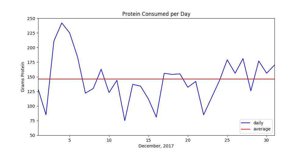
The first graph, here, is the total amount of protein (in grams) consumed per day in the month of December (2017). It mirrors the previous graph relating to calories fairly closely, as this one also has a dip in the center, which is not surprising, as one would expect protein and calories to be correlated.

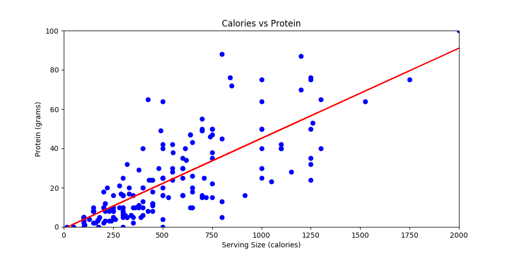
The above shows total grams of protein consumed as a function of meal size. Unsurprisingly, as meal size increased, protein consumption, also, increased.

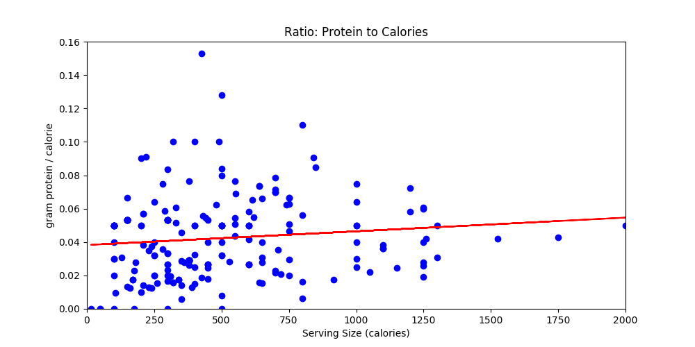
The above graph illustrates the relationship between protein and calorie consumption a lot better, as protein is indicated as a ratio (grams/calorie vs raw grams in the previous).
Either way, as caloric intake increases, so too does the amount (and ratio) of protein. This is likely due to larger caloric intakes representing 'feasts'. And my feasts tend to revolve around meat: a high protein item.
Summarized Data
And for those who prefer the data in numerical form;
days: 31
meals: 209

Calories for Month: 102226
Protein for Month: 4523
Calories / Protein: 22

Calories per Day (ave): 3297
Calories per Meal (ave): 489
Miscellaneous Notes
While tracking my calories, I made some notes. And these are those:
- The last three entries in December are a guess.
- In other words, I was happy to back-fill missing data points...
- which just so happens to be the preferred Data Collection Methodology of choice for leading researchers the world round.
- I am not counting the chocolates from the Advent Calendar, nor sips of milk (.25 cup), mouthfuls of sunflower seeds (or other nuts), nor any amount of high-fiber cereal.
- These items could add up to an extra hundred calories a day, easily.
- Actually, per serving is much more likely... in the case of nuts, at least.
Real Time Observations
- My condiment usage changed.
- I began to use hot sauce and powdered curry in lieu of BBQ sauce.
- I did not want to 'spend' my sandwich calories on mayonnaise.
- The intent, after all, was to reduce caloric consumption on some level, not just track it.
- In fact, towards the end, I'd skip the ketchup on a hamburger opting for another patty, seasoning both with only salt and pepper.
- Some thoughts regarding my eating habits:
- While on a roll, writing pushed meals back.
- And if I thought I had calories coming to me, I would indulge in a large end of the day snack, having a banana split, for instance.
Other Data Points
The second data collection series was more meaningful (helpful, insightful, and graph-able) than the first. The first recorded what I ate, but the second recorded how much. And since this caloric data was numeric, it was was easier to crunch. Also, I literally have not re-examined the first data series... so I hope I don't have any incriminating meals entries, there.
For the most, I eye-balled my calorie estimates. I did not use a scale. And for at least half of the entries, I guessed outright.
Other times, I was a bit more methodical:
Bacon, Egg, & Cheese Breakfast Sandwich
| Ingredients | Calories | Protein |
| bread | 160 | 10 |
| bacon | 120 | 8 |
| tomato | 22 | 1 |
| eggs | 140 | 12 |
| cheese | 110 | 7 |
| lettuce | free | 0 |
| Mayonnaise | none | 0 |
|
|
|
| Total | 552 | 38 |
For 14.53 calories per gram of protein!
I, actually, don't know if an exclamation mark belongs there. I probably doesn't. But since I was shooting for 20 cal/gram, which is about what whole milk or cheese has, 14.53 is looking pretty good.
Mayonnaise is listed as a non-entry, as this is about when and where, I realized I was chewing up 90 cal/ tablespoon on something I did not value all that much.
Also, note, this one sandwich (or this great big sandwich, as that's likely a better way to look at it) contains less calories than I consume in hot chocolate on a typical day.
I still drink hot chocolate. I hardly ever use mayonnaise, anymore.
Chef Salad
| Ingredients | Calories | Protein |
| lettuce | 30 | 0 |
| turkey | 75 | 18 |
| eggs | 140 | 12 |
| sun dried tomatoes | 140 | 4 |
| balsamic | 50 | 0 |
|
|
|
| Total | 435 | 34 |
For 12.79 calories per gram of protein!
Doing this chart, effected my dressing choice, as I, likely, would have opted for some sort of ranch, instead.
Salami Sandwich
| Ingredients | Calories | Protein |
| two slices bread | 160 | 10 |
| 2 oz White Cheddar | 220 | 14 |
| 8 slices salami | 180 | 16 |
| tomato | 50 | 0 |
| lettuce | 5 | 0 |
|
|
|
Total
| 615 | 40 |
For 15.38 calories per gram of protein!
And finally, I give you my true base line food group.
Cup of Hot Chocolate
| Ingredients | Calories | Protein |
| 1 cup milk | 150 | 8 |
| 3 squares chocolate | 230 | 3 |
|
|
|
| Total | 380 | 11 |
For 34.55 calories per gram of protein!
I typically have two cups of this a day. Though, while counting calories, I tried to reduce this some.
Also, collected amongst my data is an off-the-cuff cookie recipe. At this point, I'm not sure of it's utility. But I detest throwing stuff (data, whatever) out. So, I'll include it anyway.
Peanut Butter Cookies
1 egg
.75 stick butter
2 pinch salt
.5 cup peanut butter
.5 cup flour
.25 cup brown sugar
I cooked at 375° for ten minutes. And then, since that wasn't enough, I cooked the crumbles at 350° for another fifteen minutes.
I have no recollection, as to how these tasted. And without the note that I reheated the crumbles (they didn't cook well and sort of fell apart, so I reheated the crumbles), I would not have even remembered that.


 Above (and below) are probability distributions showing how likely it was for me to eat a meal of any given size. The visualization is very similar to the histogram above, the main difference being that the unit on the vertical axis is a probability rather than a number count.
