I almost don't know what I am doing, here.
I mean, I almost don't know.
The idea is simple enough: In 1877 (or perhaps, a few years prior) Gustave Caillebotte painted Paris Street; Rainy Day. And in early 2018, I spent a few days (here and there) staring at it (off and on) for a few minutes (whenever it was handy).
I, also, made some sketches... as best as I was able.
And for cheap thrills, I counted how many other folks were in the room (call it a gallery) whenever I was there.
A half year later (plus another half year, as I really did stall-out during this write-up) and this webpage is the result.
I should probably push projects all the way through from inspiration to completion at a faster clip. Part of the passion (if not all of it) is often (almost always) lost after the first few months.
Brett Rants
Paris Street; Rainy Day
There are worse things to stare at.
The Idea
The First Sitting
Like I said, one of the things I did was make a few sketches, as best as I could, while I tried to examine different aspects of the painting.
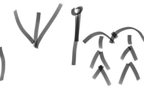
Above, please find the major structural elements of Paris Street; Rainy Day, as I see them.
From left to right, we have: two men in shadow (as shown by a single vertical line; but then, there's not much there, as it's an edge element, so a single vertical line works), a building corner (as depicted by the double-v, and which is, in my so ever humble opinion, a symbolic forced choice of sorts: this way or that, stay in the past or waltz into the future), a lamppost (the dotted 'i' in the center, which clearly calls to the illuminating effects of Science & Technology, you know, if you want the cheap metaphor), while a final couple (our protagonists, who, even as we watch, are being passed by another, not shown) walk (not quite hand in hand, toward us, into the future, so the other guy is in retrograde motion, fading into the past, even if both groups are) outfitted with one of those nifty-new steel-framed umbrellas... for protection and cover... and, well, because those things are nifty and cool and all the rage.
Anyhow, these are the main structures. It's a wire-frame snapshot of Gustave Caillebotte's Paris Street; Rainy Day, the original of which will not be shown anywhere on this page due to copyright restrictions.
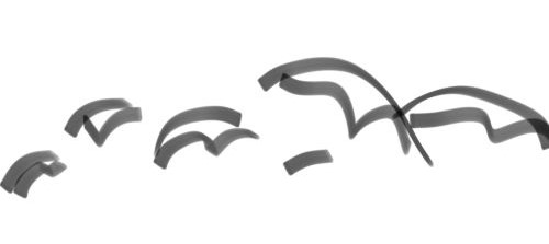
In 1851 (all dates rounded to my sense of ignorance) when Moby Dick was written, Whale Bone Umbrellas were all the rage.
A few years later (in 1877 to be exact, the date when this painting was first shown, so in all likelihood, it was completed a bit earlier), steel frame umbrellas (as detailed above) were nifty, new, quite fashionable, and all the rage.
Want to know what else was nifty, new, quite fashionable, and all the rage at that time period, as well?
Note the Gas Powered Lamp that takes center stage.
And the Gutters and Open Roads that fill the whole of the left of the painting.
In truth, I believe old Gustave (I guess, he was pretty young at the time, something like 28) was just painting a contemporary street scene. But he did choose to paint this scene in the newer part of town.
Oh, yeah. Somewhere along the line, I should mention that this particular street corner was ground zero for a riot/revolution (call it what you will) a few decades earlier. It's where all the cafes in which all the planning for the riot/revolution where located. So, the powers that be, gutted the quarter, paved the roads (for quick troop access to quell the riot/revolution, don't you know), and put up new buildings... little more than empty facades in many instances.
So, is this a revolutionary painting?
I do not know?
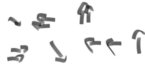
What I will tell you is that the above arrow filled sketch indicates the Direction of Gaze (as I see it) of the main(ish) human subjects, you know, where they are looking.
The two main subjects are the second and third figures (arrows) from the right. Both of them are looking to the left, to the open street... or in other words, to the past... and where that little cafe (perhaps, the one where they met) stood so long ago.
My personal randomness aside, if you ever get a chance to look at the original painting (say, by doing an image search on the web), you will (or at least, may) note, how little eye contact is being made.
Perhaps, this is a social commentary on the wide open streets, causing its inhabitants to be isolated... or maybe everyone is downhearted and wistful (looking to the past) on account of the failed revolution.
'We had such high hopes.'Of course, modern pedestrians do not look at their fellow travellers very much, either. So, maybe this is just the way the world looks.
'We were going to change the world, you know.'
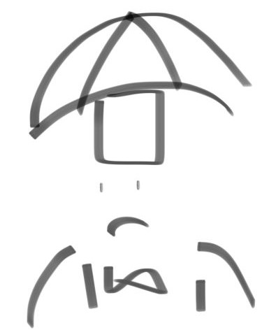
Here we have a detail of what I will call the main human figure: The Man.
He looks to the left.
Why?
To my eye, he appears a bit grim and his eyes are a bit empty, as he looks longingly to the past.
Of course, this was before photography, so folks did not smile, as much. And more than anything, the intent may have simply been for the figures walking forward (out of the plane of the painting) to not be looking at the viewer. After all, there are plenty of paintings from this time period wherein one of the subjects breaks the fourth wall and looks directly at the viewer (Georges Seurat's A Sunday Afternoon on the Island of La Grande Jatte, coming most rapidly to mind, but as that was painted a half dozen years later, unless you believe in Time Machines, Gustave Caillebotte's could hardly of had that painting in mind when he composed Paris Street; Rainy Day).
Whatever the case, to me the man is neither friendly nor happy. I take his countenance as a worried look to the future. But he could be hungry and thinking about lunch for all I know.
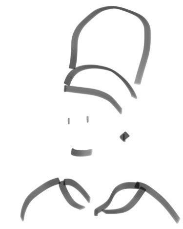
Above is a detail of the second most important figure in the painting, a woman who walks next to the man (the man detailed further above), holding onto his arm.
I note a veil covered face, lipstick, earrings, and an ermine fur collar. Well, what else could it be but an ermine fur collar. Pointedly, the woman carries no umbrella of her own. But rather, relies on the protection of her man.
I view her as being blank, empty of thought, waiting for her husband to speak, but inclined to be bright and cheery, whatever he might have to say.
It's pure projection (or if you prefer, conjecture), of course.
Maybe, I simply do not have as much practice reading females. After all, my girlfriend is shocked (shocked, I tell you) at my interpretations of reality on occasion... and/or a regular basis.
Eh, but she's just a girl (missing that all important Y-Chromosome, don't you know), so what does she know?
I mean, girl's are such silly little things, don't you think?
Not even smart enough to bring an umbrella along on such a Rainy Day...
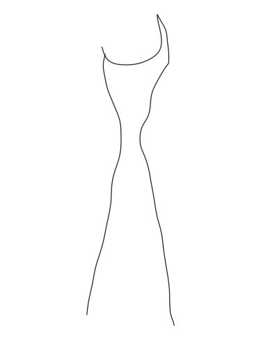
For a different point of view, I will tell you what one of the Docents and/or Guards had to say (prior to escorting me off the premises and requesting I never return). And that is that there is a cat to be seen in the area (of light) outlined between the man and the woman.
Most of what I have to say about this painting is personal... not anything Gustave likely intended.
Still, trust me on this, after you've stared at a painting long enough (or at least, after I have, and it really doesn't matter what painting it is), it's the things under the surface that tend to take hold, as they acquire a meaning all of their own.
After all, even if Gustave did not intend the cat, the cat is there to see if one desires, if one looks for it. So, perhaps, it was subliminal... an unconscious decision on his part.
There is no wildlife on the street. No cats. No rats. No pigeons. Not even a bird in the sky. Nor a clump of horse manure on the ground.
I mean, that is solid concrete (I'm sorry, paved cobble-stone) as far as the eye can see. A scene devoid of life... even the humans are half-dead zombies, stumbling blindly (or at least, un-seeingly) along.

Above the cat, snugly situated between the man and the woman, one can see a ghostly face outlined between the couple's heads.
But you know, not really.
The truth is: it's easy to see what isn't there. I've been doing it the whole of my life.
But you know, not really.
The truth is: it's easy to see what isn't there. I've been doing it the whole of my life.
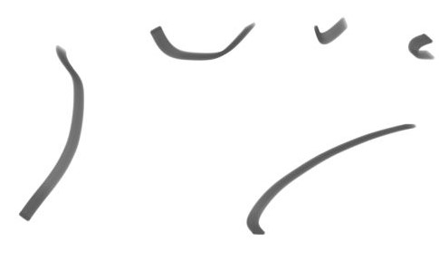
This is a simple study in structure.
We are at a five-way (at least) intersection of roads. And what, with the rain and shiny cobble-stones (call them river-stones) it is easy to see this as a convergence of water-ways.
So, we have an outline of the River Bank, above, as a bunch of tributaries come together.
It's not a very good image.
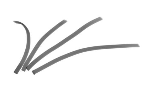
Here, we have the same thing. But rather than showing the river banks, I show the flow of the water.
I had thought about adding directional arrows at the tops of the four fingers. But in actuality (and based on how rivers, actually, work) our two protagonists (the man and the woman) are clearly (are they not) walking downstream (and with the flow of the river): the cosmopolitan couple that they are.
I should probably include another (totally hypothetical and/or hypocritical) dialogue out-take, right about here. But nothing witty comes to mind.
I had thought about adding directional arrows at the tops of the four fingers. But in actuality (and based on how rivers, actually, work) our two protagonists (the man and the woman) are clearly (are they not) walking downstream (and with the flow of the river): the cosmopolitan couple that they are.
'I say, Harriet. Now that they've gutted the Old Quarter, this is getting to be quite the trendy locale. We should pick up a flat or two before the speculators swoop in and the opportunity is lost.'And then, if you want the Post-Modern Reinterpretation, later we have the scene wherein Harriet is tossing a clay pot on a wheel (in what would typically be a breakfast nook overlooking the gated garden in back of their new condo), while leaning against an open door frame, Henry is reading the newspaper and ranting on about the oppressive propertied classes (of which he is a sterling example) .
'Quite right, Henry. Quite right.'
I should probably include another (totally hypothetical and/or hypocritical) dialogue out-take, right about here. But nothing witty comes to mind.
'Darn Tories!'
'Don't you mean Royalists, Henry? We're supposed to be Frenchies, after all.'
'Ha! Quite right, Harriet. Quite right.'

I really did not capture the essence of the moment. So, I drew the flow, once again. This time, I came up with something closer to a Hand.
And such a blatant failure (please see the sketch above if you find an open call to 'failure' unclear) was, clearly, an indication I had run off the rails and it was time to switch gears. Um, because if you'll remember, I was in an Art Museum (i.e. The Art Institute of Chicago, if you must know), sketching away, as a means of capturing the moment and giving meaning to Life, the Universe, and Everything; and so, failing at that, meant I was failing at life.
And I don't like to fail at Life, the Universe, or Anything.
So, why make sketches of a painting that I hardly care about in the first place?
Well, the why's and wherefore's of this painting are easy enough. I walk... and I walk... and I walk. Thus, upon arrival at The Institute, it was (and is) not unusual for me to want to sit down first thing and rest a spell. And Gustave Caillebotte's Paris Street; Rainy Day is at the beginning of the Impressionist Wing, which is more like a long string of galleries that connects the old part of the Art Institute Building to the New.
So, um, in case that was not clear. I chose to 'study' this painting, because it was near the entrance. It was convenient.
Of course, that does not explain why I might want to 'study' a painting in the first place. So let us just say, I like doing projects. I cannot justify them... much like one (meaning you, I, or the next guy) cannot justify, well, anything. But metaphysical hitches aside, projects tend to give meaning to the moment... for me, at least. But then, they take away from the moment, as well: distracting from The Now, don't you know. And then, these little projects of mine only give meaning to the moment in that they are like (or at least, are an attempt) to Trap Time in a Bottle, which can't be done, so it's all a Fool's Errand... and we're back to the fact that they can't really be justified any more than collecting stamps, staring off into space, or watching daytime television.
Even so...
Walking about, trying to do something that has meaning... well, I had an iPhone with me, so I thought I'd draw some sketches of a famous painting and (maybe, but you know that I will) put together some sort of website at home, a bit later.
That's the thought pattern, anyway.
And in truth, lately, I've been doing a Diary Project, which has more or less supplanted any future Painting Project. But there you are.
Oh (and just by-the-by), the sketching utility on my phone allows the inclusion of color (I know, virtually unheard of, as we enter the third decade of the 21st Century), so maybe we (or I) should look into that, don't you (or I) think? I mean, I've about had it with the near charcoal sketches, haven't you?
Thus, the above is a study in light.
One side of the painting seems very much brighter to me. Of course, which side that is tends to switch.
Whatever the case. I think we can all agree that my sketch is not very accurate.
I would say (at the moment) that the right side of the painting is brighter than the left. But what is true (from moment to moment, this, then, and the next) is that the background on the right is brighter than the background on the left. But both foregrounds are darker than both backgrounds... and there is much more foreground on the right side than the left.
Yeah, that has no meaning. Even I won't try to parse that last paragraph ever again. And even if I did, I don't know that I would agree with the analysis... much like I don't agree with it now, a mere day later.
So, let us say, I like the idea of the right side being brighter, as I have taken to interpret the right side of the painting as the future; and the left, as the past.
So, in my witty way, I will say the side of progress (the right) is much brighter (than the left), even as it looks to the past.
Or if nothing else, it's another way of deconstructing the image.
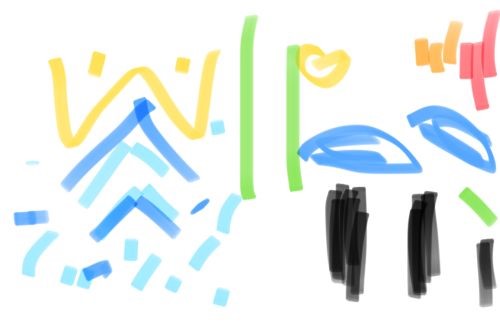
I was trying to get a 'Color Split', which is a term I just made up, so I have no idea what is means. Call it a 'Color Feel', if that makes you feel any better.
Other deconstructions in this series are better... in my opinion, at least.
Other deconstructions in this series are better... in my opinion, at least.
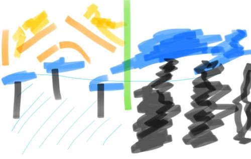
Once again, this is an attempt to capture the overall color and texture... or so, I will claim at this remove in time, nearly a year later.
My notes at the time are full of opposites and contradictions, ways of analysing the raw image, no doubt:
See, I vacillate on which side is lighter.
My notes at the time are full of opposites and contradictions, ways of analysing the raw image, no doubt:
 Left - Right


Shiny - Matte

Light - Dark


Background - Foreground


Down - Up


Open - Full

Empty - Full
See, I vacillate on which side is lighter.

To my eye, the Lamppost is a clear separator, dividing the painting in two.
Does the above have much to do with the visual representation of the image?
Likely, not.
But part of the fun in the painting is the dichotomy between the two sides.... assuming dichotomy it the word I am looking for.
Does the above have much to do with the visual representation of the image?
Likely, not.
But part of the fun in the painting is the dichotomy between the two sides.... assuming dichotomy it the word I am looking for.
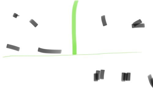
Shadow Cast: Past & Present...
Or more importantly, one cannot go from the present to the past: the green line denoting now, this moment.
Or that is what my notes read. My interpretation is not (altogether) the same now as it was then.
Either way, I like the (grid-like) separation in this image (above) better than (the vertical halves in) the previous. The above sketch has the lamppost dividing the painting (in green), once again, with the major areas of darkness indicated, while the horizontal green line represents the base of the lamppost.
I would like to extract better symbolism from this four-way split than I have from the two-way split of Past & Present.
But alas, nothing comes to mind.
Besides, I don't believe Gustave thought it out that far.
As a Color scheme? Sure.
As a Symbolic Representation of Reality? Not so much.
Freehand Interpretation
OK!
The fine!
Shall we have a bit of fun?
But what to say?
It's more of a game than anything real, so...
It is clear A Rainy Day shows the image of a Paris street. And if I were there, I'd be snug in a cafe, sipping on my hot chocolate, with way too much time on my hands to think and watch the world spin, as drops of rain trickle down the window and I wait for the weather to clear.
So, take the lamppost. It is easy for my mind to call the lamppost Enlightenment. And in the past (left), the figures walk towards the lamppost (towards the idea), while to the right, they walk away from progress, turning their backs on it, going ever lower, toward their baser desires. But what is even worse is that they are not even looking where they are going (clearly, not even caring), as they (the couple, you and I) are about to run into the viewer, blocking their way, impeding the progress of the lone man (who is hardly ever mentioned in these throw-away deconstructions), who is, also (just by-the-by) coming in from the far right... and therefore, is (clearly) in the right.
Eh, it is so much gobbledygook.
Still, it's the type of gobbledygook I am drawn to.
Though, let us all take a deep breath and admit it is so much gobbledygook.
One should know when they are spouting BS.
Tiananmen Square Tens Years Later
I, really, don't know that I have much to say beyond the title (of this here section: Tiananmen Square Tens Years Later) that I have not already said... or hinted at.
In my head, I (sometimes) call this painting Tiananmen Square: Ten Years Later. The conceit being that Gustave was a revolutionary (in his heart, if nowhere else). And as such, the painting was a post-mortem of the movement. I mean, it's odd how the future blots out the past.
Anyhow, I know that in the wake of the (mid-century Parisian) riots the powers that be bulldozed certain sections of the city, put in wide streets, which gave the troops easy access, and they (the powers that be, once again) engaged in what would today be called social-reconstruction: i.e. they engaged in a bit of your friendly neighbourhood gentrification.
I know, I have just traced the barest of outlines. But it is easy enough (for me) to see (my eyesight, perhaps, being better -- or at least, different -- than yours) the couple as a pair of ageing hippies as they walk through Silicon Valley.
The Internet is a wonderful thing. But is it the future you wanted? The future you wanted for your children?
The world is freer and less free all at the same time. We have more. And we have less.
Let us be honest, I am a late-adopting techno-phile, which means in many ways, I am a Luddite.
I mean, it would be so much easier for me (or a helpful other, sweet one that she is) to make my hot chocolate in a microwave, every morning. But there is no microwave in sight. And can't we all, at least, agree that hot chocolate tastes better if it made on a gas-fired stove... and probably, better still on a wood-fired stove... or better yet, while the cup is held over an open flame.
Of course, wood-fired stoves are expensive luxuries these days. And that's why almost no one has one. It's probably a thousand times cheaper to run a microwave than a wood-fired stove.
And although I see the after-effect of a failed revolution in Rainy Day, it may (much more significantly) signal the rise of the Middle Class... and my own ability not only to indulge in hot chocolate on a daily basis, but to be able to prepare it somewhere along the middle lines of luxury (i.e. via a gas fired stove).
I get Real Chocolate & Real Heat. But I fall short of the total luxury of having it made by costumed servants in mid-century garb, sweating over a Wood Fire.
Sounds nice, doesn't it?
And next, you'll (or at least, I'll) be wanted to illuminate your/my evening with beeswax candles.
Come on!
Get a grip!
Or better yet, is any of what I am saying clear... or unclear?
Wide streets mean gutters, which indicate a lack of open sewers: sewers which would have made this intersection so noxious (we are talking about the flotsam of the human body here) that no man of leisure (call him a painter) would ever in their right (or left) mind want to set up shop (that is to say, set up an easel) and paint the scene.
So, maybe, we should call Rainy Day by another name, perhaps something closer to the truth of what the scene represents, you know, something like An Idyllic Absence of Abject Poverty!
Seriously, not a beggar, drunkard, or poor person in sight. Clearly, a snapshot of reality if ever there was one!
I mean, that's what those Impressionists were all about, right?
Reality?
That's why Impressionism is called Abject Realism, after all, right?
In my head, I (sometimes) call this painting Tiananmen Square: Ten Years Later. The conceit being that Gustave was a revolutionary (in his heart, if nowhere else). And as such, the painting was a post-mortem of the movement. I mean, it's odd how the future blots out the past.
Anyhow, I know that in the wake of the (mid-century Parisian) riots the powers that be bulldozed certain sections of the city, put in wide streets, which gave the troops easy access, and they (the powers that be, once again) engaged in what would today be called social-reconstruction: i.e. they engaged in a bit of your friendly neighbourhood gentrification.
Out with the old.So, is Rainy Day a homage? A remembrance? Or a celebration of the success of social restructuring. After all, the riots did die off. And the victors did (and still do) get to write history.
In with the new.
Beggars Begone!
I know, I have just traced the barest of outlines. But it is easy enough (for me) to see (my eyesight, perhaps, being better -- or at least, different -- than yours) the couple as a pair of ageing hippies as they walk through Silicon Valley.
The Internet is a wonderful thing. But is it the future you wanted? The future you wanted for your children?
The world is freer and less free all at the same time. We have more. And we have less.
Let us be honest, I am a late-adopting techno-phile, which means in many ways, I am a Luddite.
I mean, it would be so much easier for me (or a helpful other, sweet one that she is) to make my hot chocolate in a microwave, every morning. But there is no microwave in sight. And can't we all, at least, agree that hot chocolate tastes better if it made on a gas-fired stove... and probably, better still on a wood-fired stove... or better yet, while the cup is held over an open flame.
Of course, wood-fired stoves are expensive luxuries these days. And that's why almost no one has one. It's probably a thousand times cheaper to run a microwave than a wood-fired stove.
And although I see the after-effect of a failed revolution in Rainy Day, it may (much more significantly) signal the rise of the Middle Class... and my own ability not only to indulge in hot chocolate on a daily basis, but to be able to prepare it somewhere along the middle lines of luxury (i.e. via a gas fired stove).
I get Real Chocolate & Real Heat. But I fall short of the total luxury of having it made by costumed servants in mid-century garb, sweating over a Wood Fire.
Sounds nice, doesn't it?
And next, you'll (or at least, I'll) be wanted to illuminate your/my evening with beeswax candles.
Come on!
Get a grip!
Or better yet, is any of what I am saying clear... or unclear?
Wide streets mean gutters, which indicate a lack of open sewers: sewers which would have made this intersection so noxious (we are talking about the flotsam of the human body here) that no man of leisure (call him a painter) would ever in their right (or left) mind want to set up shop (that is to say, set up an easel) and paint the scene.
So, maybe, we should call Rainy Day by another name, perhaps something closer to the truth of what the scene represents, you know, something like An Idyllic Absence of Abject Poverty!
Seriously, not a beggar, drunkard, or poor person in sight. Clearly, a snapshot of reality if ever there was one!
I mean, that's what those Impressionists were all about, right?
Reality?
That's why Impressionism is called Abject Realism, after all, right?
The Second Sitting
a week or two later
Crowd Effect Drawings
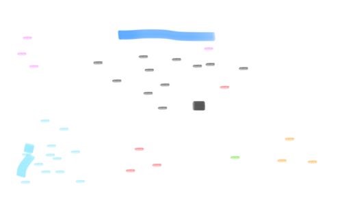
This is a study of The Crowd. Different groups are colored differently, but as I only had seven (or so colors) to work with the idea of a group is fairly liquid.
The painting Rainy Day is the blue line straight ahead, with additional paintings lining the wall. This is not a very good representation of the room.
The painting Rainy Day is the blue line straight ahead, with additional paintings lining the wall. This is not a very good representation of the room.
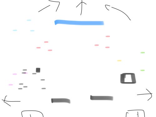
Blue Line: Rainy Day
Arrows: Walkways, exits, note that the main exit out of the room is behind the wall on which Rainy Day is mounted
Black Lines: two benches
Black Square: Goya (I think) sculpture of a ballerina (turns out I was wrong, it's Degas... or so I have been told)
Dashes (and the small square to the left): are patrons, more or less accurate (as accurate as such a thing can be) at the time of sketching
Clearly, I became less interested in the content of the painting and more interesting in it's setting.
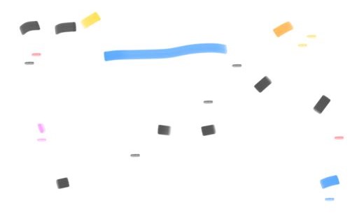
Another Room Count
There really is not much to say.
There are two sketches I made that I did not post on this page. One is of a vertical green line, representing the lamppost, which is not very interesting. And the other shows the tops of the umbrellas. But I made another sketch of the same thing, which is better, so I used that one instead.
Thus, let me say, part of this project is to record what I did... even if I no longer care about vast stretches of what that was... namely, the room counts to come.
The Count
"I love to count!"
I'll say that about on average, there were about thirty people in the room. Rather than killing it completely, I will keep the raw data in the comments (see the raw underlying HTML if interested). But I really do not care about the numbers, anymore. And trying to make some sense of that data is likely why this project has taken so long to bring to a close. Thus, nip it in the bud. The Room Count data is meaningless.
Suffice to say, this is a popular room at the Institute, if for no other reason, because it is a transitional gateway room.
Suffice to say, this is a popular room at the Institute, if for no other reason, because it is a transitional gateway room.
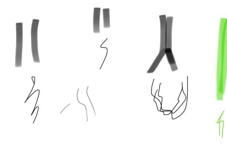
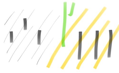
This is a highlight of the shadows on the left side of the painting, only.
I was captivated by the symbolism (perhaps of my own making) of Past & Present, with the Lamppost dividing the two. In that interpretation, the shadows on the left side (the past) held a sort of importance to me (being Shadows of the Past, if you will). And so, I sketched them.
My notes from way back when include such ditties as 'note the unmanned shadow in the middle, perhaps calling to mind blood-puddles and/or riotous memories'.
It can be fun reading too much into a painting.
Wrapping Up the Day
My final notes (presented more or less unedited, so perhaps I should break on the day here, as, you know, not bothering to edit my notes indicates a decided lack of energy and/or enthusiasm for the project at hand):
Time to break on the day and finish the last section, tomorrow.
Presciently, only two horse and buggies are shown in the painting: both half hidden... and both facing (and therefore) riding into past.But yeah, getting a bit tired, here.
Whereas, on the right, the two umbrellas in the foreground are almost colliding into one another. Clearly, there is little notice of others close by and the effect one might have on them.
Time to break on the day and finish the last section, tomorrow.
Third Sitting
The Final Sitting
I started getting into color more.
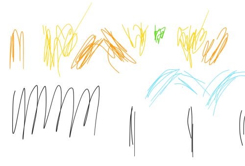
So, like, I actually have a photograph of the actual picture in front of me as I write this page up. Sorry, about not posting one for you, here. But you know, I don't need the grief of a Take-Down Notice.
Anyhow, between the sketch above, my notes, and an actual copy of the painting... which I took, myself, as The Art Institute is OK with that, in fact, encourages that, but lo to thee who steps on The Art Institute's Intellectual Property Rights Toes... or you know, so I presume, I really don't want to find out...
Um, whatever.
It's not all by memory. That's what I'm saying.
Thus, I can say with all confidence, the sky in this painting is pretty darn cool. It's the same sort of sky that Monet painted time and time again. It may have had something to do with the technological advances in painting pigments at the time: in that, it was easier to achieve this sort of bright pastel color (than it had been in years past). But it was obviously more than just a technological innovation. Bright pastels became a sort of fad, a fetish.
Me?
I like it.
The sky glows.
Here!
Try this some day, some summer day. Walk around outside until you eyes are nearly burnt out. Then duck into an art museum (say The Art Institute of Chicago, located right there on Michigan Ave) and head on up to the Impressionist Wing (no need to run) and watch the paintings dance on the canvas as your eyes acclimate to the dark. It's a trip.
So, like, the sky in Rainy Day glows in a surreal sort of way. I remember going outside as a child after a tornado, thunderstorm, or whatnot (clearly, my parents wanted to get rid of me; and as such, encouraged me to play in the mud, while lightning danced about) and I'd look up into the sky (but not even the sky) and the whole world would have this green tinted glow... as if the grass was happy (high even), suffusing the world with an aura of life.
The sky in this painting has the same effect. It's a post-rain-shower pre-twilight. And Gustave (the painter) is just sort of enjoying the end of the day, as the sun goes down behind the buildings and the whole world glows.
So, like, remember all that time (in the paragraphs above) that we spent in the cafes, drinking this and sipping on that?
The world is high, man... or do you prefer, dude?
Whatever.
The world is high, dude.
The sky reflecting off the cobblestones, bouncing off the buildings, it's all the same amber (is that amber) glow. Only the people are morbid and black. Everywhere else, there is life.
So any-the-way, the sketch above is a study in the sky, in the reflections, in the subtle use of color, which besides the umbrellas (Wow! What a novelty! A painting about umbrellas!) is one of the (enduring) long-term calling cards for this painting and why it 'guards' the entrance to the Impressionist Wing.
Taste the rainbow!Or better yet:
Feel the sunshine!
Dance in the rain!
Avast ye g'ard forsaken philistines, cast the image of trendy umbrellas from yer brain-dead mind and look closer; for, there is beauty to behold!
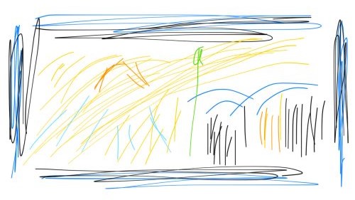
Here's another study in light. But as a special bonus, I included the blue-gray walls of the museum by way of a frame.
I've spent quite a bit of time in Hawaii. And not all of paradise is sunny. Some of the (mountain) locales (on the windward side, especially) suffer from the extreme gloominess of a perpetually overcast day. Sure, it's beautiful when the sun peeks through. But the sun doesn't always peek through.
Oh, see, here was the joke. The Real Estate Agents would call the Wet Side of the Island (the parts where it rained on a daily basis, where for many long days in a row, the sun never daring to peek through) the Green Side. It just sounded better. So, like, the locals divided the island into the Wet Side and Dry Side (along with a whole bunch of other divisions), while the Real Estate Agents called the same two divisions the Green Side and the Sunny Side.
To change the subject slightly (and quite counter intuitively), painting interior walls a dark shade of purple in such a gloomy locale made the windows pop. While, painting the ceiling a warm orange (nicknamed, Waimea Yellow in my world) would cause the interior of a house to positively glow.
So, there you have it, a painting done in Paris Yellow, surrounded by a dark blue-gray (gray-gray) wall that makes the entire thing pop.
I've spent quite a bit of time in Hawaii. And not all of paradise is sunny. Some of the (mountain) locales (on the windward side, especially) suffer from the extreme gloominess of a perpetually overcast day. Sure, it's beautiful when the sun peeks through. But the sun doesn't always peek through.
Oh, see, here was the joke. The Real Estate Agents would call the Wet Side of the Island (the parts where it rained on a daily basis, where for many long days in a row, the sun never daring to peek through) the Green Side. It just sounded better. So, like, the locals divided the island into the Wet Side and Dry Side (along with a whole bunch of other divisions), while the Real Estate Agents called the same two divisions the Green Side and the Sunny Side.
'Well, it does rain, here, on the Green Side quite a bit, that's why it stays so green. Maybe you'd like to look at something on the Dry Side. It's pretty sunny over there... and astoundingly desert like, at times.'We had frickin' cactus growing on the slopes that led down to the beach... on the sunny side, that is, where it hardly ever rained. Hence, why the resorts where built there... and at one time (warning, history lesson ahead), the land was dirt cheap, because without water, sugar and pineapples are sort of hard to grow... and what else would you do with a acre of land in paradise than grow some sort of Cash Crop (like weed), anyhow?
To change the subject slightly (and quite counter intuitively), painting interior walls a dark shade of purple in such a gloomy locale made the windows pop. While, painting the ceiling a warm orange (nicknamed, Waimea Yellow in my world) would cause the interior of a house to positively glow.
So, there you have it, a painting done in Paris Yellow, surrounded by a dark blue-gray (gray-gray) wall that makes the entire thing pop.
So even on a rainy day, the sky really stands out... calling forth the magic of the moment, a hope for a golden future full of wide streets, drainage gutters, and automatic umbrellas... oh, and if you look closely, you can see a cat nestled in between the couple's legs.
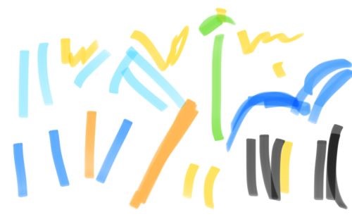
The final Color Study.
It may be informative to recall that every last one of my sketches took the same image as its starting point.
So, like, I'm either really good to get such a wide range of results... or I suck at drawing beyond belief.
It may be informative to recall that every last one of my sketches took the same image as its starting point.
So, like, I'm either really good to get such a wide range of results... or I suck at drawing beyond belief.
End Game
At first glance, the key to deconstructing Gustave Caillebotte's Paris Street; Rainy Day (for me, anyway) is the subject matter: the wide streets, the gutters, the curbs, the gas-fueled lamppost, and the umbrellas. Man, you got to love those umbrellas. I mean, this is a Modern Painting of a Modern Street scene. So, get with it and dig those umbrellas, dude.
Of course, given that this is a modern street scene, I juxtapose the image in my mind against what I know was there (at this very locale) thirty odd years before. I mean, this (this very corner) was literally ground zero for the Revolution... or at least, some good old fashioned Street Riots, wherein the proletariate stood up to The Man, man.
Can you dig it?
We're talking Tiananmen Square Tens Years Later, dude.
I'm saying it's San Francisco after the Silicon Revolution, you corporate shill.
Both (all three) are no doubt better than they were before. I am a fan of the future, can you tell? But then, is this really what we (or they) were going for?
So, mull that over. Let it sink in.
And then consider (or take that second glance, after staring at the painting for a long-long while), that it's really about the color.
It's not like the world was a two tone, black and white, greyscale place two-hundred years ago. But the brights were not as bright (even if the darks were a whole lot darker). So when we (or at least, I) am looking at Gustave Caillebotte's Paris Street; Rainy Day, I am (or maybe, we are) looking at a moment of inflection when color (in all it's pastel glory) leapt onto the scene.
Dude!
The Coolness has just begun!
Of course, given that this is a modern street scene, I juxtapose the image in my mind against what I know was there (at this very locale) thirty odd years before. I mean, this (this very corner) was literally ground zero for the Revolution... or at least, some good old fashioned Street Riots, wherein the proletariate stood up to The Man, man.
Can you dig it?
We're talking Tiananmen Square Tens Years Later, dude.
I'm saying it's San Francisco after the Silicon Revolution, you corporate shill.
Both (all three) are no doubt better than they were before. I am a fan of the future, can you tell? But then, is this really what we (or they) were going for?
So, mull that over. Let it sink in.
And then consider (or take that second glance, after staring at the painting for a long-long while), that it's really about the color.
It's not like the world was a two tone, black and white, greyscale place two-hundred years ago. But the brights were not as bright (even if the darks were a whole lot darker). So when we (or at least, I) am looking at Gustave Caillebotte's Paris Street; Rainy Day, I am (or maybe, we are) looking at a moment of inflection when color (in all it's pastel glory) leapt onto the scene.
I give you... Pink!As a point of comparison (or if nothing else, as a desperate attempt to tie the last photographic image in with the text by way of a sideways reference), the same thing is happening with Digital Photography, today.
Dude!
The Coolness has just begun!
next Brett Rants entry
Home Brett Rants Index
The truth is even if I did not start a single new project, I do believe I would have projects enough to last me until the end of the New Year. I need to catch up... or cull the pile.
Still, if I were to do a write-up for another painting, which painting would I do next?
Still, if I were to do a write-up for another painting, which painting would I do next?
© copyright 2018-19 Brett Paufler
paufler.net@gmail.com